Advertisement

In this project I created a surf board company named Slick Design Surf Boards becausse I love surfing and thought it would be cool to create my own. For variation I used four different fonts for the information on the flyer. For the main background i feathered a drawing of the world famous surf spot Teahupoo because it collaborates with the company's motives and the event they will be sponsoring. Feathering helped balance the flyer. In order to make the flyer more readable and creative I placed an image of a wave in the lettering of the business name. It looks much cleaner and balanced in color.
CD Cover


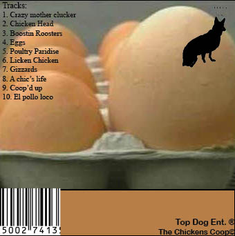
In this project I created a band named The Crazy Chickens for some humor. The album is called the Chickens Coop. For creativity and balance I typed the title of the band on curved paths that led to one another. I also created a clipping path for a roosters head to coincide with the name of the band. The background is a barn and chicken heads to represent chaos like the name implies. For the record label i created Top Dog enterprises and created a silhouette of a dog and crown. This was a clipping path but when printed it prints with a white background.
Event Flyer

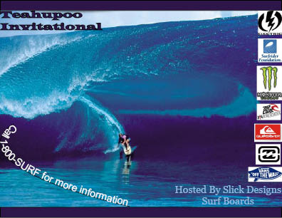
To go along with the surf company I created a post card for our invitational surf contest we are holding. The event is named The Teahupoo Invitational so for creativity and balance of colors I created numerous pallets of colors derived from the background image. For the call information I typed on a curve to represent a wave of words. To add to the power of the postcard I placed many surf sponsors along the side of it to attract the eye of upcomming surfers. I also placed the image purposely to make the focal point of the image not directly in the center for creativity and variation.


